


A logo is the face of your brand,
the image associated with all that you do.
As a designer, it is my joy to work with my clients
to help establish a brand and presence
that is unique to you.
Let's Begin.


Emblem logo
Emblems are the oldest types of logo design.
An emblem is a logo type that features text, a symbol, or imagery inside a geometric shape. It has the power to give a traditional feel to your brand.
They are often richer in detail than other types of logos giving an official look to your brand.
Pros: Once you come up with a good emblem logo, your brand will surely stand the test of time. Moreover, the chances to find another brand with a logo similar to yours are significantly smaller.
They’re memorable, professional, and give a powerful feel to your brand.
Cons: Probably, the only disadvantage to the emblem logo is the scalability. Since they’re detailed, they may not look so good when resized to a smaller resolution or not so readable when placed on a billboard.


Brandmark logo
A Brandmark logo is imagery reduced to its symbolistic meaning. This is why, if you’re leaning towards this type of logo design, it has to be extremely representative, containing elements that will make your audience associate it with your brand. A logo symbol plays a crucial role in brand recognition, as it can convey meaning or emotion through a standalone image or symbol, often representing real-life objects or abstract shapes.
Pros: Maybe your brand can be represented through a simple image/symbol. Another great way to use this type of logo is to convey a meaningful idea through a symbol, where the words can’t express it well enough.
Cons: If your business is still fresh and you didn’t manage yet to have a solid base and a stable target audience, it’s better to start with something more explicit for your brand’s logo and adapt it as a brandmark later.

Mascot logo
A mascot logo is a drawing of a person or a non-human entity that received human form or human attributes.
This type of logo creates a friendly and positive feeling towards your audience. You can use a mascot logo and give it different expressions and representations, depending on the message you’re trying to convey.
Mascot logos are used for sports teams, food brands, or service companies.
Pros: If your brand targets families and children, the mascot logo is a great way to go. It will help you establish a fun and friendly approach.
Cons: It can be difficult for professional or businesses with a somber ambience to utilize a mascot logo effectively.


Abstract logo
These marks are significant in conveying a brand’s core values, providing room for creativity and flexibility, and aligning the design with the brand’s identity.
It can be a bit risky to use when you’re new on the market, as not everyone interprets an abstract representation the same way. Still, with a good strategy behind it, your brand’s logo will differentiate you from all the competitors out there.
Pros: With an abstract logo that still manages to showcase your brand’s identity, you’ll create something unique and instantly recognizable on the market.
Cons: If you’re a new brand making a name for itself, you may have to put some extra effort in helping people know your brand’s reputation. The solution here is to create an abstract logo that conveys the specific feeling you’re aiming for, and maybe join in with the brand’s name for a while, just until people get to know you.


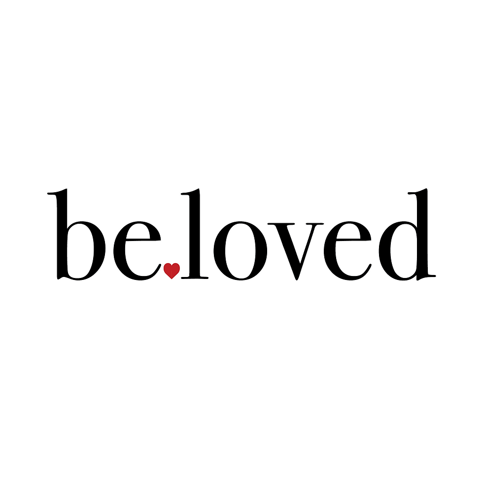
Logotypes
Among the most powerful types of logo design out there, we have the logotypes, also known as the wordmark logos. Wordmark logos are significant in brand identity as they are based solely on stylized text, usually the brand’s name, and reflect the brand’s personality through the choice of font.
The logotype definition is simple. They’re composed entirely of the company’s name. On a logotype design, you won’t find symbols, graphic patterns, or emblems.
Since the main feature of the logotype design is typography, the best choice is to have a font specially designed for your logo.
Pros: It’s a simple yet impactful way to get your brand’s name out there. Once you have the font and your logo’s style, you can mix it with other elements and create logo variations.
Cons: The logotype won’t work if your brand has a long name.
Also, in time you may have to change the fonts to keep up with font design trends.


Lettermark logos
Lettermarks (or monograms) are a cool way to reduce your brand’s name to an acronym. Take the initials from each word of your brand’s name, and you’ve got yourself a logo.
The only part left is to think of typography. You have to come up with an eye-catching and unique font since the lettermark logo design uses just a few letters.
Pros: If your brand’s name has several words, then this logo kind is perfect for you, especially if you don’t want to use only a visual symbol.
Cons: If you’re a new company on the market using a lettermark logo, it may confuse your audience. But this situation has an easy solution. At first, you can use your lettermark logo, and underneath it, place the full name.